
How it was built
Component audit & consolidation
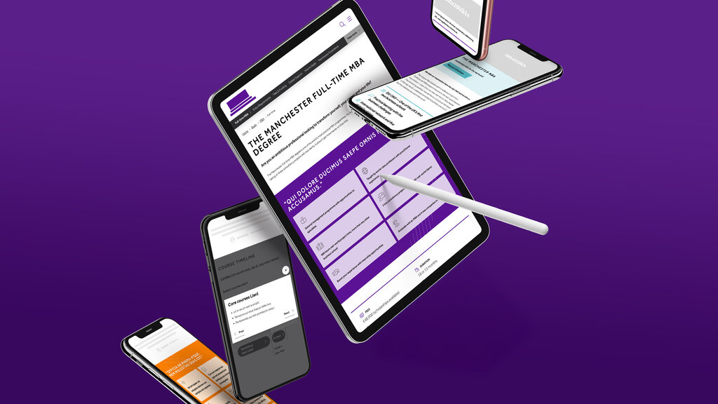
I began with a comprehensive audit of existing components across all products. It revealed many duplicate implementations of common patterns. I identified the most reliable versions, mapped usage patterns, and consolidated them into a core set of reusable components.
Atomic design methodology
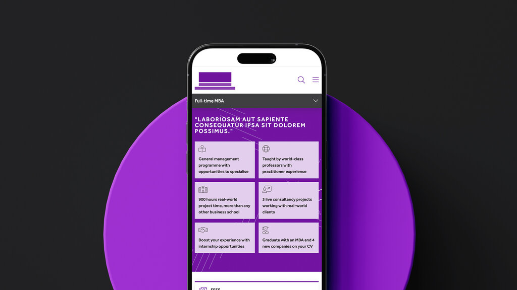
The system followed atomic design principles: design tokens formed the foundation, primitive components built upon them, and composite patterns combined primitives into complete features. This hierarchy ensured consistency whilst maintaining flexibility.
Design token architecture
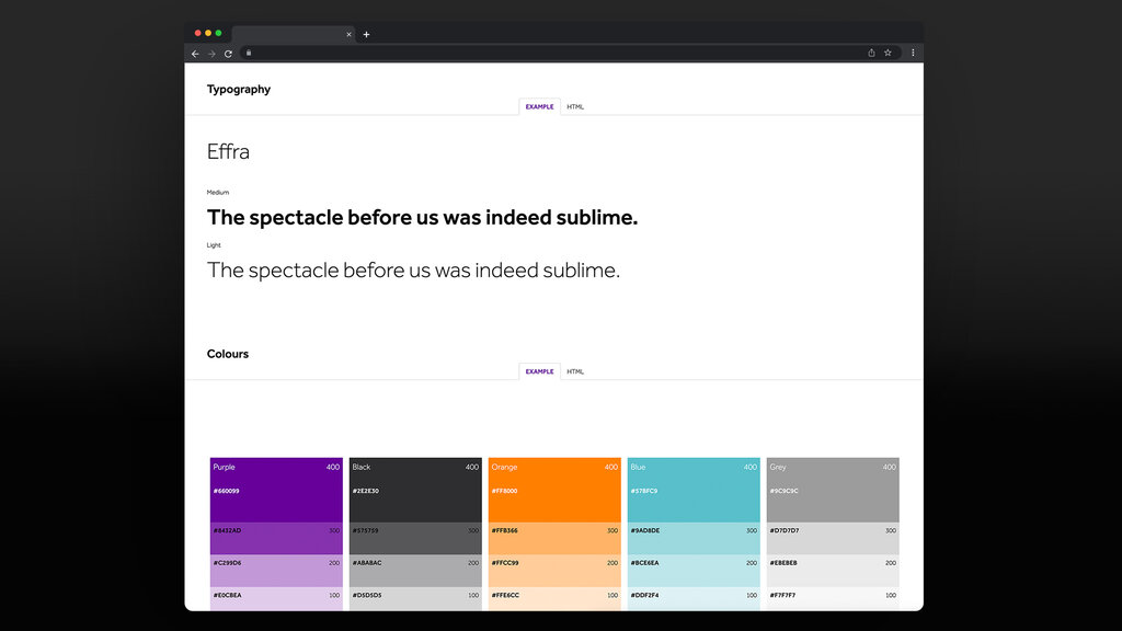
I implemented a design token system synced directly from Figma to code. Colours, typography, spacing, and other design values existed as single-source tokens. Changes in Figma automatically generated updated code, eliminating manual synchronisation.
Interactive documentation
Storybook provided live documentation for every component. Developers saw working examples, usage guidelines, accessibility notes, and code snippets. Each component included multiple states, variants, and composition examples.
Migration strategy
Rather than forcing immediate adoption, I created migration tools: codemods automated component updates, mapping guides showed equivalent patterns, and gradual rollout allowed teams to migrate at their own pace.
Technical implementation
Type safety
TypeScript ensured components were used correctly. Prop types prevented invalid configurations, discriminated unions enforced valid state combinations, and strict null checks caught edge cases during development.
Accessibility testing
Every component included automated accessibility tests. I validated ARIA patterns, keyboard navigation, focus management, and colour contrast. Visual regression tests caught unintended changes before they reached production.
Lessons learned
Building a design system requires more than technical execution. Success depends on adoption strategy, documentation quality, and migration support. Teams adopt willingly when the system solves their problems better than their own components did.
Automated testing proved essential. Visual regression tests caught breaking changes early. Accessibility validation caught issues without waiting for manual audits. CI/CD integration prevented regressions from reaching production.
Design tokens created unexpected value. Beyond ensuring consistency, they made brand updates and theme customisation quick.
Starting small and iterating proved more effective than attempting perfection. I launched with core components, gathered feedback, and expanded based on actual usage patterns rather than theoretical needs.
Technologies used
- Frontend: HTML5, TypeScript 4.9
- Documentation: Storybook 7, MDX
- Styling: CSS custom properties generated from design tokens
- Testing: Jest, Testing Library, Chromatic
- Build Tools: Webpack 5, Rollup
- Version Control: Semantic versioning with Changesets
This project demonstrated that systematic design infrastructure accelerates development whilst improving quality - a combination that drives both technical and business value.